Getting started
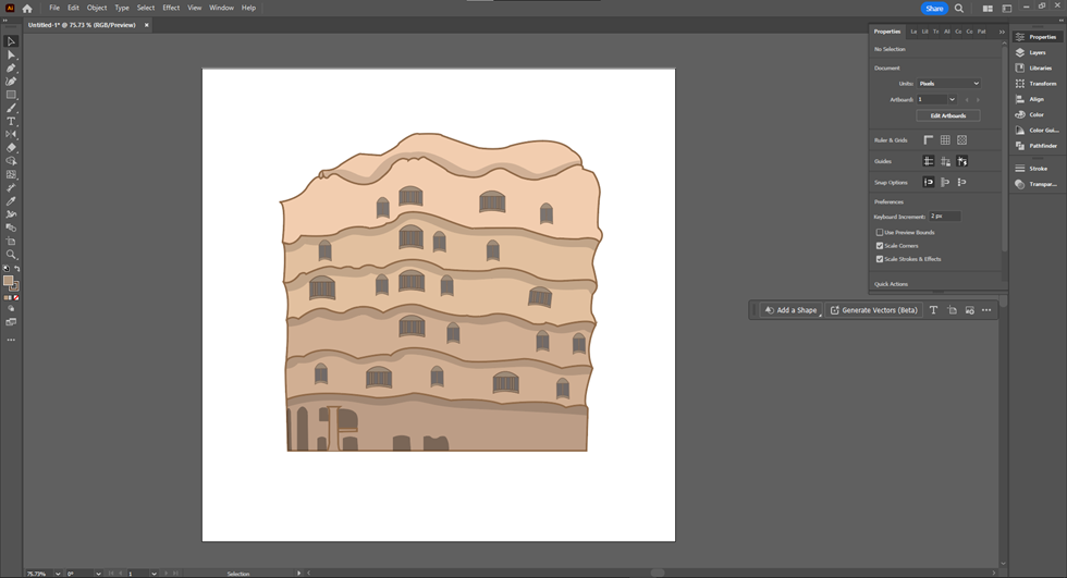
After deciding on the Gaudí-inspired Art Deco theme, I wanted to bring that inspiration to life visually. To start, I chose one of Gaudí’s iconic buildings and began illustrating it in Adobe Illustrator. This process helped me break down his complex designs into simpler shapes and patterns that I could then translate into my CSS layout. The illustration became the foundation for my design, giving me a clear direction on how to blend Gaudí’s organic, flowing forms with the sleek, structured lines of Art Deco.
Applying the style
Once I had the style figured out from my Gaudí illustration, I moved on to the actual page design. I picked a color palette that mixes Gaudí’s bright, vibrant hues with the classic rich tones of Art Deco. Then, I applied these colors consistently across the whole site to keep everything looking unified. I also started rounding the sections and elements to bring in that organic, flowing feel that Gaudí is known for. This softened the sharp Art Deco lines and added a more playful, dynamic vibe. Combining these colors and rounded shapes helped blend the structured elegance of Art Deco with Gaudí’s unique, whimsical style, making the whole page pop with personality.
Final Touches
With the style in place, I moved on to the finishing details to really tie everything together. One of the key touches was finding the right font. I wanted a serif font that captured the elegance and sophistication of Art Deco but also complemented the more playful, organic elements inspired by Gaudí. After some searching, I found a font that balanced both vibes perfectly. Adding this font across the site helped enhance the overall aesthetic, giving the text the same polished yet artistic feel as the rest of the design. These final touches brought everything together, making the page feel complete and true to the vision I had from the start.